Showing posts with label master bedroom. Show all posts

Thursday, February 19, 2015

BEST OF HOUZZ 2015

I NEVER WIN ANYTHING. Raffles, giveaways, games at parties, (like the guess how many gumballs in the jar game), and definitely not awards. So when I saw a message in my inbox from "The Houzz Team" that said, "You won..." I was super excited! It could have said, "You won a free subscription" and I would have been thrilled. But this was even better - I actually won Best of Houzz 2015 in the Design category. And they gave me a badge for my website and a certificate to display!

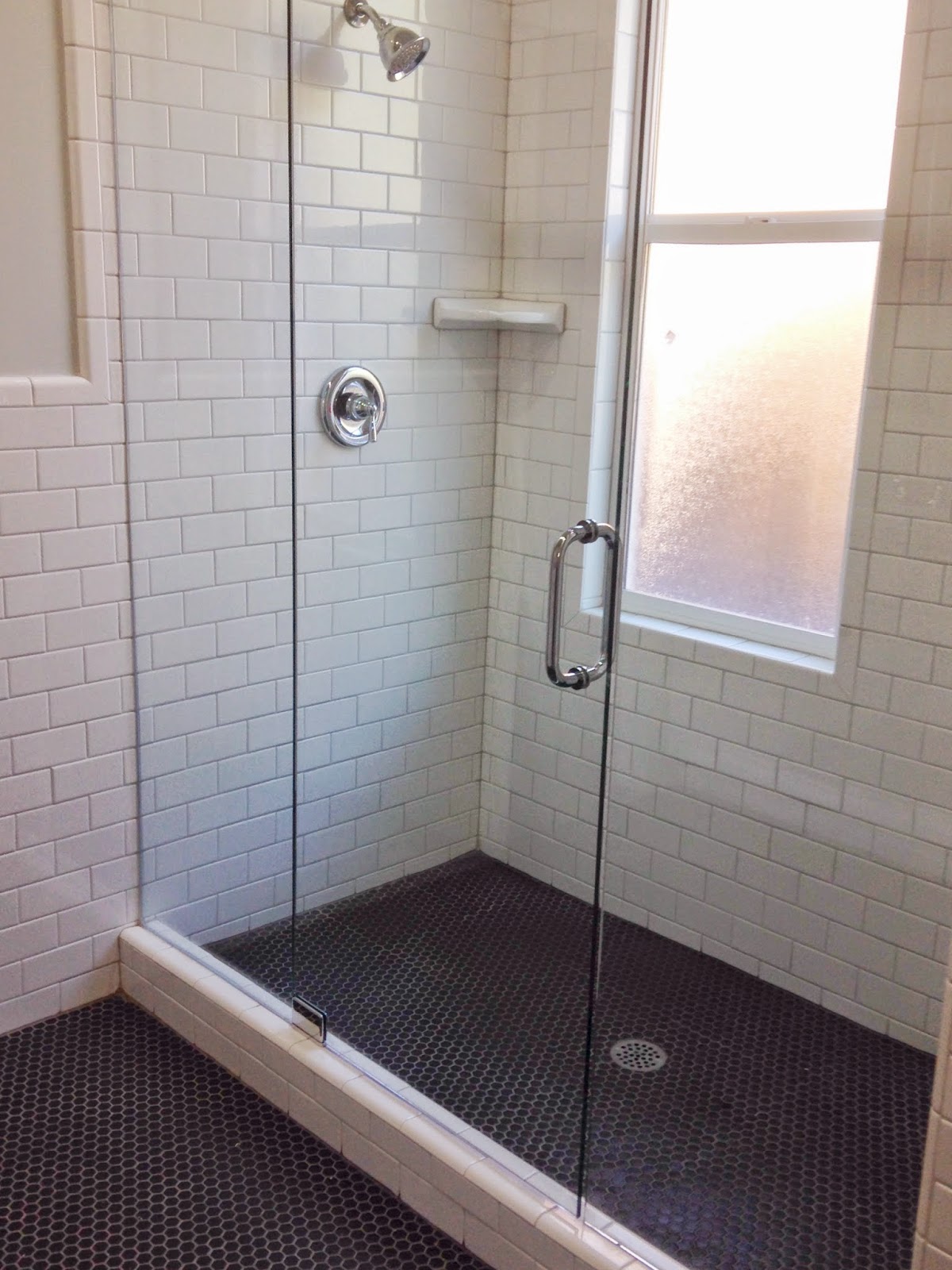
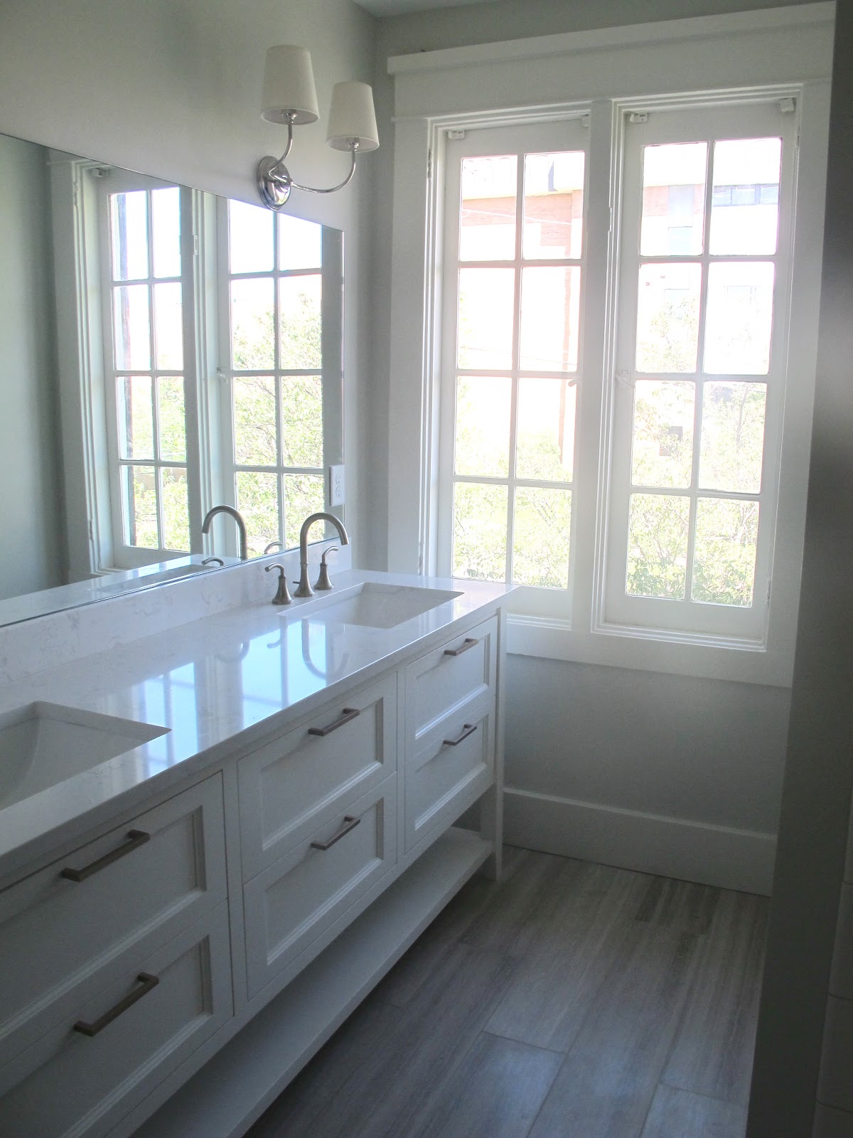
my badge and certificate for my award!

The little kid in me is really excited about this. It just felt good to win something and get a BADGE! I mean, when was the last time someone gave you a badge? Even if it is for my website and blog. I am wearing it proudly.

And this was the room that helped me win this prestigious award...


Yes, it's my master bedroom that was so well captured by the talented Emily Brown. And it's funny, because this room is probably my least expensively decorated room. With nightstands and a rug from Ikea, bedspread and skirt from Target, and $30 art from a consignment store. The only expensive item is the headboard, which is custom and was the big splurge of the bedroom coming in at $1200. 

I do love this room today as much as I did four years ago when we moved into our new home. The best part about it is that I don't feel like I need to redecorate it because it feels really timeless to me, but not boring. (a win-win) Thanks Houzz community for sending the love my way and giving me this award!

And in honor of this award I'm going to post my newest project that I posted to Houzz, next week. It's one of my all time favorites, and I can't wait to share. Look for it on Monday and have a great weekend!

Friday, September 26, 2014

REMODEL PROJECT: M STREET


I'm excited to finally post the pictures from my recently finished flip project of this charming Avenues project. Below are a mixture of photos from the listing on the MLS and my phone. I apologize for the less-than-professional pictures, but if I waited to have it professionally shot, it would never happen (unfortunately).

THE STATS

214 N M Street, Salt Lake City, Utah
2,005 square feet
$459,000
3 Bedroom
3 Bath (2 full)
2 car garage
Built in 1910


I decided to keep it simple and classic in this home. When doing a flip it's so hard to know what the end buyer is going to love or hate! Because this home was built in 1910 I wanted to use vintage finishes, like honeycomb tile, brass hardware, and subway tile. There is definitely a black and white theme throughout the home - but what is more timeless than that color combination? 

The home was completely gutted and the floor plan redone. All of the flooring, base and case, and finishes are new. Hope you like this one!

front door detail - so charming!

Entry/Dining Area
FLOORS: White Oak (sand and finish in place) 
LIGHT: West Elm

it's all in the details - original leaded glass window

Living Room

Fireplace tile close-up
SCONCES: Circa Lighting
TILE: Black marble herringbone tile from Salt Lake Tile Company

Kitchen with mixture of marble and wood 

Desk area


the view from the sink - this window lets in the prettiest light!
The built-in hutch adds a lot of storage and a great way to display plates, cookbooks, even artwork!

COUNTERTOPS: Carrara Marble
BACKSPLASH: Carrara Herringbone tile from Salt Lake Tile Company
HARDWARE: Jeffrey Alexander Pulls & Knobs

Master Bath


FLOOR TILE: Black 1" Hexagon tile from Arizona Tile
SHOWER TILE: White Subway tile from Home Depot
VANITY COUNTERTOP: Carrara Marble
SCONCES: Circa Lighting

Powder Bath
Laundry room/mud room 

View of the mountains from the laundry room window - just ignore the satellite dish :)

2 Car Garage (rare for the Aves!)
This home is such a charmer in person, and I hope you got a little sense for it from my pictures. There of course is more to the home, but these are the highlights. If you live in Salt Lake City and are in the market, you must stop by! This home won't last long and it is such a great area. Call BJ Blaser to show the home @ 801-309-7603.

And get excited for two more projects that I am finishing in the next couple of weeks! 
Here are a couple of snapshots/teasers...


Friday, February 8, 2013

MARIANNE SIMON DESIGN

I had the nicest email in my inbox yesterday from Seattle based designer Marianne Simon. Because she and I share the same name and spelling she sent me a little note saying "hi" and introducing herself. And guess what? Her work is amazing! She is super talented and I'm so happy to have "met" her (isn't it funny how we "meet" people online?)

I wanted to share her great work. It's classic, classy, simple, and sophisticated. Her style reminds me of my bff Darryl Carter.

Enjoy these beautiful images and check out her website and blog!
*all images from Marianne Simon Design


Have a great weekend!

Wednesday, August 8, 2012

BEFORE + AFTERS: C STREET PROJECT II

This house is my favorite of the two because it has these wood grid windows that are beautiful and would be SO expensive to recreate (one of the pluses of owning a home built in 1901). It also has a European feel to it. It's just a charming home.

I hope I did this house justice :)

                                          457 C STREET                                        

Do you see those great windows? And how sad that they had dry walled over the fireplace - so bizarre.
I decided to make this a more traditional home than the other home. We chose oak floors with a dark stain and did wainscot on the walls. The sconces are Robert Abbey and the fireplace surround is a crema marfil marble remnant.

Again, we removed the radiant heat (although I thought these heaters were super cool and underneath the silver paint they were a beautiful brass color).

This was the dining room just off the main room. We tore out the wall and made the dining room the new kitchen. I love those doors leading to the deck!
The beautiful windows in the dining area.

The old kitchen that became the new dining room.
The new kitchen! The cabinets are painted BM Dove White and the hardware is a brushed brass. The island light is the Axis Double Light from Robert Abbey (ignore the plastic still on it). The countertops are quartz countertops made by Cambria, (the color is Torquay) that I mentioned in this post. I was happy with the way they turned out, but they definitely aren't the same as marble.

I love the little square cabinets above the window - perfect for storing the pretty plates and bowls.


I did the same tile from Emser in both houses for the laundry/1/2 bath room.

Same carpet on these stairs as the other home. I like that this staircase has the wainscot on the side.
The upstairs 3/4 bath has the same configuration as the other home. Nothing too exciting to work with.
I did the same 3x6 Desert Gray subway tile from Dal Tile but the flooring is different - it's the octagon and dot in Desert Gray from Dal.

This close-up is a better representation of the true color of the tiles.
The master bedroom was similar to the other home in that it was long and narrow so we divided it up and made one half of the room the master bath.
I LOVE this bathroom. The vanity turned out so great. We had a narrow space between the vanity and the shower wall so I didn't want to do lower cabinets and we did a shelf for storage instead. All of the drawers are functional, but we also added a tall storage cabinet on the side for extra storage.

The sconces are from Circa Lighting and the floor tile is this limestone from Dal Tile that I am obsessed with. It is by far my favorite bathroom floor tile. Another client put it in her home and it looks great there too.
The storage cabinet we added. These cabinets were also painted BM Dove White and have the Cambria Torquay countertops that are in the kitchen.

The master shower. I had spent most of my tile budget for this bathroom on the limestone floor tile so I needed to do white subway in the shower. My original plan was to do chair rail squares to mimic wainscotting but to save money we just decided to break up the subway tile with bands of tile going vertical instead of horizontal. Plan A would have looked better, but I'm liking Plan B.


For some unknown reason I didn't take as many pictures of this house for the before or after - sorry no pics of the bedrooms (although unfurnished bedrooms aren't ever very exciting). 

Overall I am happy with the way both of these homes turned out, but I'm also excited to take what I learned on this project and do it even better on the next one. I think one thing is for sure - I have learned how to stretch a dollar and get a lot of style out of a small budget.

On to the next one...!


Related Posts Plugin for WordPress, Blogger...