Friday, November 16, 2012

MY LIVING ROOM UPDATE

For some reason in my home I can't feel totally satisfied with my living room/family room. I love my side chairs and I like my sofa and ottoman, but I have a hard time accessorizing this area. What pillows? Where do I put the throw? On the ottoman, on the sofa, where?! I've also been trying to fill up the wall behind the sofa and finally found some antique prints that I really liked.

Here is my living room before...

I loved my City Square Pillows with the gold rope piping, but they were constantly in the way and getting moved every time we sat down on the couch. I decided I wanted lumbar pillows and it honestly took me 2 months to find a fabric my husband and I liked (and then he ended up not liking them).

Here is my front room now (the other photo is professional, this is an iPhone photo so the color is very different - my first photo is a better representation of color)...


 In this photo my pillows are all lined up - not sure how I like them. Which way do you like?

I have been in a very velvety mood for the last few months so I decided on a yellowish gold velvet. I like how it picks up the tones from my gold mirror, but for some reason I feel like this room might be too grown-up for me. I really wanted to do a graphic animal-ish print like this to add some graphic appeal and color, and to balance out the antiques and gold tones.


But I don't know if that feels right either. My husband thought we might get sick of the animal print pillows too quickly - he wanted something more basic and classic. What do you think? I am loving the lumbar size but not quite sure about the fabric.

I do love my new antique prints however. And I'm a symmetry gal so I liked them on each side of the mirror. My husband wanted to stack them and find something for the other side of the mirror, which we still might do, but I kind of like it this way.


My living room is ever-changing and always evolving. It's funny that I have a harder time with my own home than I do with choosing things for clients. Maybe it's because I'm always seeing it and over-thinking it. I need to take a step back and try and look at this room objectively. I would love your help! What do you think?

Thursday, November 15, 2012

BLUE VELVET SOFA FOR SALE!

Do you remember this post that Jamie did on BLUE VELVET? Do you remember this beautiful couch from Jonathan Adler that we are loving?

Well it just so happened that I had a garage sale going on that Saturday up the street from me and I spotted a fantastic mid-century sofa for only $50 and knew it needed me to give it a new life again (even though I didn't need it or have anywhere to put it!) The lines on the sofa were somewhat similar to the Jonathan Adler sofa and I had an idea...

So I called my good friend Brian @ Rocky Mountain Upholstery and had him come pick up the couch to reupholster it, and give it new cushions (because this couch really did live in the mid-century!)

I searched and searched for the perfect blue velvet, that wasn't crazy expensive (velvets tend to be) and found this fantastic Duralee velvet in Ocean. It was tricky finding a blue velvet because they can look a little purple or some were dull. I wanted it to have dimension but be a true deep navy blue velvet and I couldn't be happier with the fabric. It is 100% Cotton, but it will wear fabulously and if you protect it with a Scotch Guard you should be good to go!

SO here is the reupholstered blue velvet sofa! And unfortunately for me I think I need to sell it even though I love it in my office. This beauty is for sale for $1550 (local pick up only, unless we can figure out a way to ship it!)


The velvet color in this photo is a better representation of the color in person.


It sits very comfortably, although probably not the sofa you want to go in your basement for watching football games. It's a perfect front-room/living room/family room/office sofa. Think of the possibilities!

You can create an eclectic graphic look by adding bold patterned pillows mixed with vintage furniture and a large fun print.


Or add a pop of yellow paired with a traditional rug in an office to create a more "Mad Men" look.


I love the idea of putting a vintage velvet sofa in a traditional home with a large graphic print overhead. This has been a long-time favorite of mine. (must add brass accents!)


Or add some silky Asian-inspired pillows and floral prints to give it a girly glam look.


That coral pom pom looks amazing next to the blue velvet - add some coral accents (pillows, vases, a lamp or even a pom like this photo) to make your blue velvet sofa look like a jewel!


How beautiful is this room?! Love the blue velvet sofa with the camel-colored leather chesterfield sofa! (Notice how this blue velvet sofa has the white wood below like my sofa!)


Or style it like Emily Henderson with a very cool graphic canvas and a cow hide rug (Ikea has a great one).


Can you see the many possibilities! Send me an email if you are interested!


Tuesday, November 13, 2012

A VINTAGE FLUSHMOUNT + NEW FAV PAINT

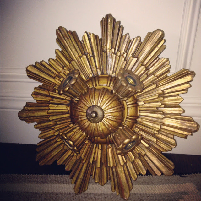
I was at my favorite antique store in SLC (Thomson & Burrows for you locals) and saw this beautiful art-decoish flush mount made of wood and painted a beautiful gold color. I had to have it and whomever buys the N Street home is one lucky winner of this light because Jamie and I really want it for ourselves.


This light will be in the dining room of N Street in the coffered ceiling, somewhat like this photo from the House Beautiful kitchen of the year. (the blue color on this ceiling is a little too Las Vegas for me)


You get the idea. It's going to look really nice.

And we just finished painting N Street. I chose Benjamin Moore's Halo (one of the OC colors) and everyone loves it. It's a little green, and a little tan. It's a soothing color that is great for homes looking for a nice warm neutral. I'm going to add this to my list of favorites (with Revere Pewter, Intense White, Gray Owl, and 50 shades of white, of course).


And while we are talking paint colors. Have you checked out my BFF Darryl Carter's paint line with Benjamin Moore? It's AMAZING! I can't wait to use one of his colors on my next project.

I'm loving his Sheridan Gray.

And Grantham Blue

If you have a question about paint color and what to paint your room, don't hesitate to contact us! We love paint consultations!

Monday, November 12, 2012

HOTEL TOUR - WASHINGTON SCHOOL HOUSE, PARK CITY

If you live in Utah and you have picked up a design magazine in the last year you will have seen photos of the Washington School House Hotel in Park City, but the other day I picked up my Traditional Home Magazine and saw a feature on the hotel in there and I remembered how much I love this hotel. For my next birthday or anniversary I am going to put a weekend stay at this hotel on my list, for sure!

The design of this hotel is almost EXACTLY how I would want to design a hotel if ever I had the chance. It is a wintery dreamland filled with antique furniture and velvet sofas.

The hotel was designed by Paul and Shannon Wehsener of Paul Allen Design based out of California. Here are some photos from the hotel's website. Check out their photo gallery for more (I know I can't get enough!)


Amazing, right?! Hope you enjoyed these photos of this hotel as much as I did! Happy Monday!


Related Posts Plugin for WordPress, Blogger...