Showing posts with label kitchens. Show all posts

Thursday, March 7, 2013

MY FAV KITCHEN ISLAND LIGHTS

I have a thing for lighting. I think every designer has their favorite element/category of design they love the most or feel the most comfortable with. For me, it's lighting. I've said it before and I'll say it again - the lighting choices you make will make a bigger impact on the room than almost anything else - especially in the kitchen. And that is why I wanted to share with you some of my favorite kitchen island light fixtures!
(click on pic to enlarge)

1 / 2 / 3 / 4 / 5 / 6 / 7 / 8 / 9 / 10 / 11 / 12 / 13

Most of the lighting options above would look best in a pair or in threes, so keep that in mind. There are SO many great lighting options out there it was hard to narrow it down, but I chose these lights because I feel they are unique, bring a lot of style, and are well made. I can recommend all of these fixtures with no worries. 

Each kitchen is so different and there are so many choices that it can be overwhelming. If you are trying to decide between some lighting options contact us for a consultation (if you are local) or you can do it through our E-Design or Design Dilemma program! 

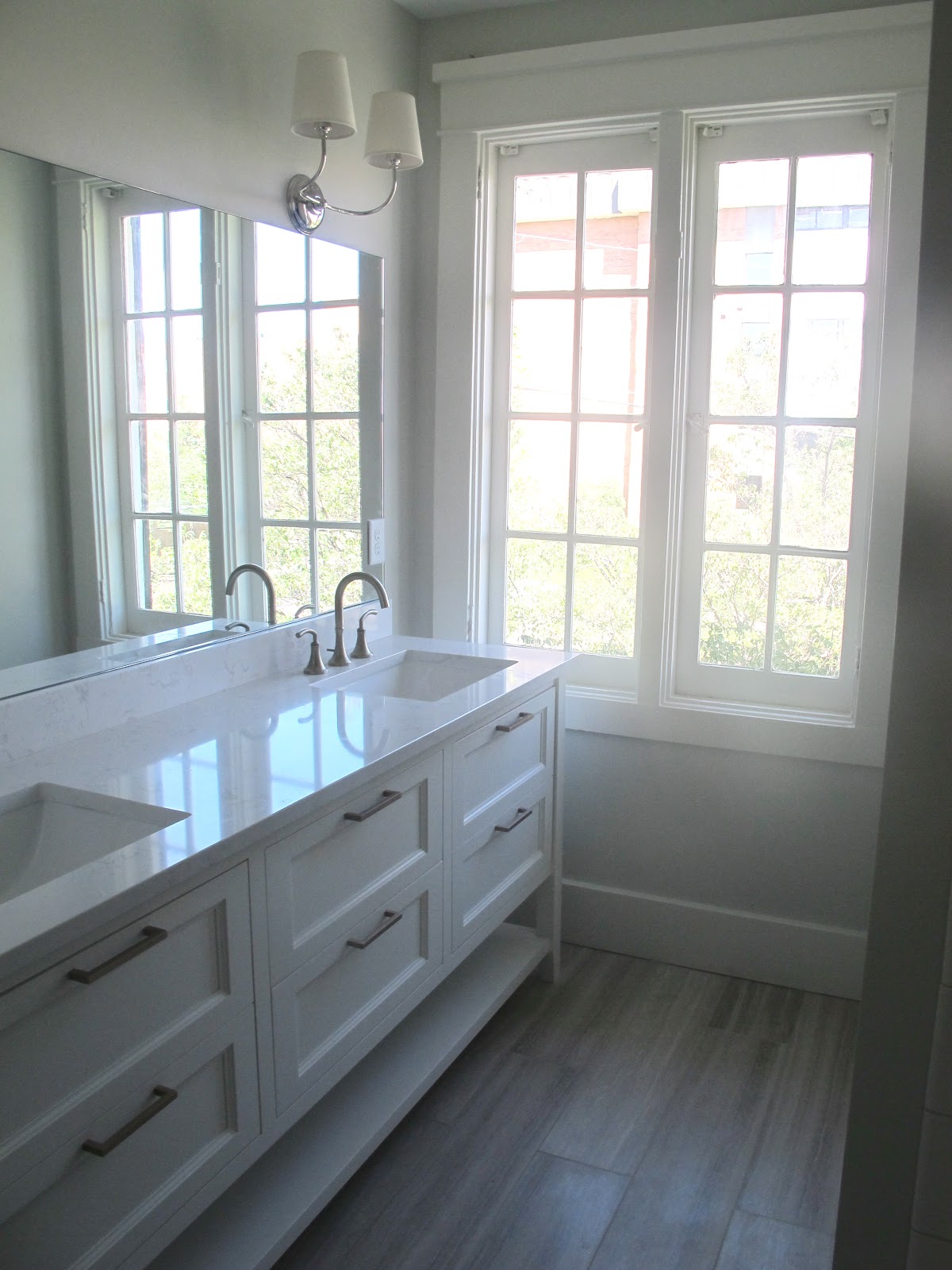
Below are rooms that have these lights in them to inspire you...


#9


#12


#7

#2


#8

Hope you enjoyed my favorite kitchen island lights! Would love to hear what your favorites are...

Friday, February 8, 2013

MARIANNE SIMON DESIGN

I had the nicest email in my inbox yesterday from Seattle based designer Marianne Simon. Because she and I share the same name and spelling she sent me a little note saying "hi" and introducing herself. And guess what? Her work is amazing! She is super talented and I'm so happy to have "met" her (isn't it funny how we "meet" people online?)

I wanted to share her great work. It's classic, classy, simple, and sophisticated. Her style reminds me of my bff Darryl Carter.

Enjoy these beautiful images and check out her website and blog!
*all images from Marianne Simon Design


Have a great weekend!

Thursday, October 4, 2012

SOAPSTONE COUNTERTOPS - MY OTHER FAV ALTERNATIVE TO MARBLE

I am constantly thinking of countertops. It's sad, I know. But I worry a lot about countertops. This is because of the many requests for a more durable alternative to marble countertops, or rather a prettier alternative to your basic granite countertop. I've already posted about my love for marble countertops and some alternatives here, but I have a new one to add...SOAPSTONE.


This material is really gorgeous. I think this slab with the ogee edge is my personal favorite I've seen.

Soapstone comes from Brazil, as do many of my favorite countertop surfaces. Soapstone is also known as Steatite. It's a non-porous surface that doesn't need to be sealed, but you should oil it with mineral oil to keep the nice dark black color. Oiling the soapstone also helps if your countertop gets scratched. You can oil your countertop as little or as much as you want. *Be careful when choosing your slabs - some soapstones have a little green in them so make sure you choose wisely :)

Soapstone is very durable and extremely heat resistant. In fact pizza ovens are made with soapstone! So go ahead and take that boiling pot of water and set it on your countertop.

Soapstone is priced similarly to man-made quartzites like Caesarstone or nicer granites. That would make soapstone less expensive than a lot of marbles.

Here's what I personally love about soapstone. 1) It is a nice clean surface. 2) It is a non-porous surface 3) It varies from slab to slab and some types of soapstone can even look a little like marble 4) It's more affordable than some of my other favorite countertops and 5) It's a classic countertop that will outlast the trends.

For more information about soapstone I found this website to be very helpful.

And now for my favorite pics of soapstone countertops!


soapstone backsplash


soapstone in the bathroom - love the gray color!


*If any of you have soapstone countertops or has any advice for those wanting to put soapstone in their homes I would love to hear from you! I've never used soapstone in my own home or in a project yet so I'm really curious to hear reviews. Thanks for your comments!

Friday, August 24, 2012

INSET VS. OVERLAY CABINETS

I have two bids for cabinets for one of my projects. One company does full overlay cabinets and the other does inset cabinets. One is more expensive than the other (inset) but does it really matter?

Quick education in cabinets if you aren't familiar...
FULL OVERLAY CABINETS means the door of the cabinets have less than 1/8" between them, or are fully laying over the cabinet so you don't see the cabinet strip between or on the sides of the door.

INSET CABINET DOORS are flush with the front edges of the cabinet boxes. The doors actually shut flush in the cabinet box rather than over like the overlay. (kind of a box within a box)

I have FULL OVERLAY doors in my kitchen.

And in my investment property we did INSET cabinets


Can you even tell a difference? I can't really, although I am drawn to kitchens with inset cabinets. They seem to be designer's first choice. However there is a slight difference - inset cabinets, because of the way they are made, have less room in their drawers than full overlay cabinets. If you have a small kitchen, full overlay may be the way to go, but the difference isn't substantial enough to not do inset in my opinion.

With that said here are some pictures of other cabinets with full overlay and inset cabinet doors. Let me know if you have a preference - I am really curious to hear if you think it matters, especially since inset are more usually more expensive...

FULL OVERLAY CABINETS


INSET CABINETS


What do you think? Inset or Full Overlay cabinets?
If you still can't decide, the debate goes on HERE.


Wednesday, August 8, 2012

BEFORE + AFTERS: C STREET PROJECT II

This house is my favorite of the two because it has these wood grid windows that are beautiful and would be SO expensive to recreate (one of the pluses of owning a home built in 1901). It also has a European feel to it. It's just a charming home.

I hope I did this house justice :)

                                          457 C STREET                                        

Do you see those great windows? And how sad that they had dry walled over the fireplace - so bizarre.
I decided to make this a more traditional home than the other home. We chose oak floors with a dark stain and did wainscot on the walls. The sconces are Robert Abbey and the fireplace surround is a crema marfil marble remnant.

Again, we removed the radiant heat (although I thought these heaters were super cool and underneath the silver paint they were a beautiful brass color).

This was the dining room just off the main room. We tore out the wall and made the dining room the new kitchen. I love those doors leading to the deck!
The beautiful windows in the dining area.

The old kitchen that became the new dining room.
The new kitchen! The cabinets are painted BM Dove White and the hardware is a brushed brass. The island light is the Axis Double Light from Robert Abbey (ignore the plastic still on it). The countertops are quartz countertops made by Cambria, (the color is Torquay) that I mentioned in this post. I was happy with the way they turned out, but they definitely aren't the same as marble.

I love the little square cabinets above the window - perfect for storing the pretty plates and bowls.


I did the same tile from Emser in both houses for the laundry/1/2 bath room.

Same carpet on these stairs as the other home. I like that this staircase has the wainscot on the side.
The upstairs 3/4 bath has the same configuration as the other home. Nothing too exciting to work with.
I did the same 3x6 Desert Gray subway tile from Dal Tile but the flooring is different - it's the octagon and dot in Desert Gray from Dal.

This close-up is a better representation of the true color of the tiles.
The master bedroom was similar to the other home in that it was long and narrow so we divided it up and made one half of the room the master bath.
I LOVE this bathroom. The vanity turned out so great. We had a narrow space between the vanity and the shower wall so I didn't want to do lower cabinets and we did a shelf for storage instead. All of the drawers are functional, but we also added a tall storage cabinet on the side for extra storage.

The sconces are from Circa Lighting and the floor tile is this limestone from Dal Tile that I am obsessed with. It is by far my favorite bathroom floor tile. Another client put it in her home and it looks great there too.
The storage cabinet we added. These cabinets were also painted BM Dove White and have the Cambria Torquay countertops that are in the kitchen.

The master shower. I had spent most of my tile budget for this bathroom on the limestone floor tile so I needed to do white subway in the shower. My original plan was to do chair rail squares to mimic wainscotting but to save money we just decided to break up the subway tile with bands of tile going vertical instead of horizontal. Plan A would have looked better, but I'm liking Plan B.


For some unknown reason I didn't take as many pictures of this house for the before or after - sorry no pics of the bedrooms (although unfurnished bedrooms aren't ever very exciting). 

Overall I am happy with the way both of these homes turned out, but I'm also excited to take what I learned on this project and do it even better on the next one. I think one thing is for sure - I have learned how to stretch a dollar and get a lot of style out of a small budget.

On to the next one...!


Related Posts Plugin for WordPress, Blogger...